Logos and Corporate Design
The logo has formed the core of the Volkswagen Foundation's design identity since 1999. It is made up of a visual and a word mark and, with its high recognition value, is now firmly anchored in tradition. The visual "Impuls" mark with its dots, which vary in size, symbolises a change of direction and the impetus that the Foundation gives to research and science. The shape of the logo and the defined distances between the elements may not be changed. Original templates in various formats, colours and colour spaces are available for use.
Guidelines for the use of the logo
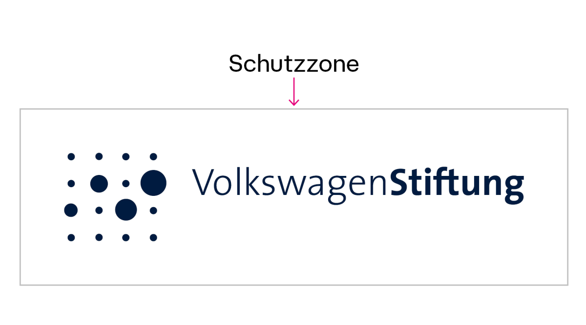
Protective zone
- The protective zone forms a free space around the logo and thus a safe distance from other design elements.
- The protective zone corresponds to half the height of the visual mark.
- Exception: A ‘Funded by’ notice may be placed within the protection zone in order to ensure that the content is associated with the logo. The font of the reference can be freely selected depending on the project design.

Color variants and background
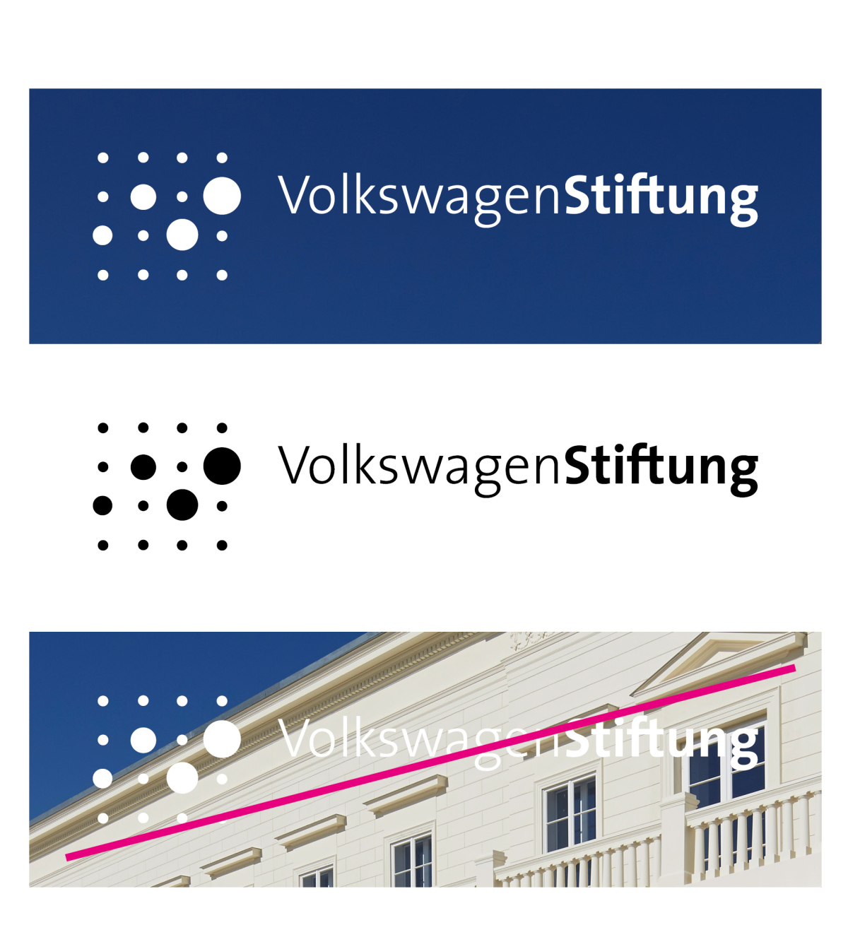
- The Foundation's standard logo is blue and should be used in this colour whenever possible.
- The logo can also be placed on a coloured, calm background. For this application, it is available in white (inverse).
- The logo can also be used in black in individual cases, taking into account technical production conditions.
- The logo must not be placed on unstable or low-contrast backgrounds. The logo should also not be placed at an angle.

Logo files for download
Please note: EPS files for desktop publishing, e.g. for agencies and printers, are available on request from presse(at)volkswagenstiftung.de.
Please note: The Volkswagen Foundation logo may only be used in connection with the Foundation's funding activities and not for advertising purposes. Please send the Communications team a "specimen copy" – by e-mail if you wish – showing the use of the logo to: presse(at)volkswagenstiftung.de. Feel free to contact us if you have any questions.
Corporate Design: Colors
The design of the Volkswagen Foundation is generally characterised by a high proportion of white.
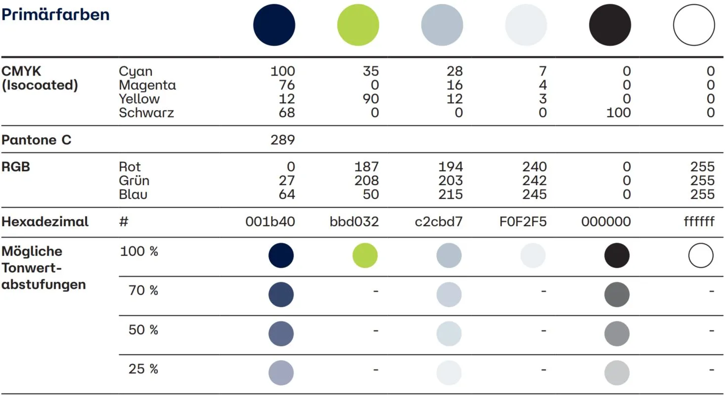
The primary colours take precedence over all other colours. They are an integral part of all communication materials and the central recognisable feature of the Volkswagen Foundation brand. Dark blue is the defining brand colour. It serves as the main surface colour and is used in the typography and graphic decorative elements (lines). Green is only used as an accent colour. It is used as a decorative and award colour. Black is primarily intended for typography (quantity texts).

Contact

